Imagine waking up tomorrow and your website sales have doubled! 🙀 And not just one day, but everyday from now on. And they keep growing and they continue to exponentially scale. 📈
How would you feel? 💃🏻
What impact would it have on you and your family? 💰
What would you do with the extra income into your business? 🎉
Well, this is possible.And without spending $1000’s on facebook ads to achieve it.
You need to want make sure your website is converting as high as possible. Let me say that again.
You need to want make sure your website is converting as high as possible!
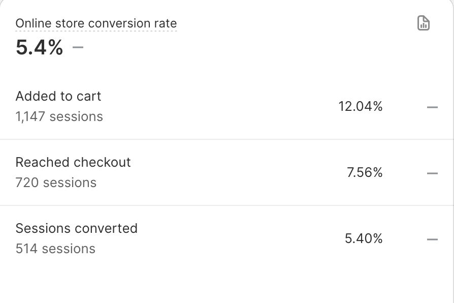
What does that mean? Well it means for every visitor you have coming to you -more of them add to cart , more of them go through to checkout, more of them click purchase than ever before.
AND you make more sales!!! (hopefully double!)
Your conversion rate for an ecommerce store (on average) is between 1 and 3%. Obviously, the higher that is the better as well. But it’s very normal to be between that range. But even if we can change and tweak that, add to cart and conversion rates slightly a little bit, it’s going to contribute to more sales for your website.
So how do we make that happen? Without it taking 6 months, and you paying money to a web developer or designer.
You start by making sure you have these 10 things right on your website.
Little tweaks and changes to try and boost that conversion rate!! SO every visitor is doubly as likely to buy!!
Let’s get into what they are;
1. Maximise Your Navigation Menu
You must have a clear navigation menu. It should categorize your products effectively, making it easy for customers to understand how to make a purchase. The top menu is for selling also so make sure most of the menu items are showcasing your actual products. and avoid to many telling items (ie information that doesn’t need to be at the tip but can be in your footer.

2. Effective Call-to-Action Button
You must have prominent call-to-action buttons that stand out and are ‘above the fold’. They should be easily visible without scrolling and guide customers on what to do next. I recommend changing the design or color of the buttons periodically to keep them fresh and attention-grabbing (based in the background image).
shown here is the gethommey.com website.
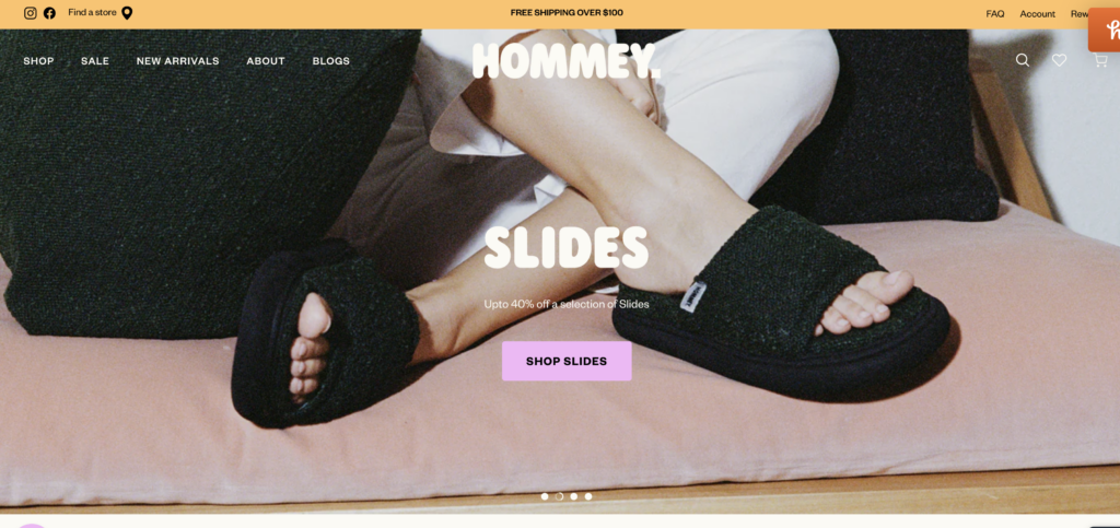
3. Include a Search Bar
A search bar that is easily accessible near the navigation menu allows visitors to quickly find what they are looking for. Analyzing the search terms used by customers can also provide valuable insights into their preferences. This can also help you figure out if new items should be added to your navigation menu.
4. Build Trust with Reviews and Social Proof
Include reviews, testimonials and user-generated content (UGC). This adds social proof and trust. These indicators on the homepage are essential to build credibility and encourage purchases. These elements can significantly influence a visitor’s decision to buy.
5. Showcase Store Benefits
I highly recommend you add a banner that showcases store benefits, such as free shipping or unique selling points, with icons that convey the information visually. This strategy can effectively highlight the unique selling points of your business without clogging your page with too much text.
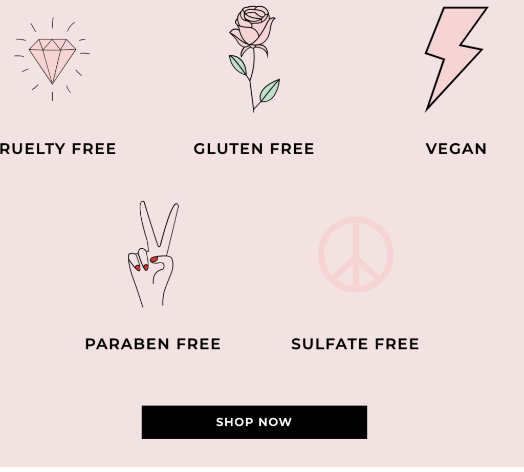
6. Make Shipping Information Visible
Clear shipping information should be provided on the homepage and also in the announcement bar. This ensures customers know what to expect and don’t have to search for this information. Make it obvious and in your face so there is no doubt what your shipping rate is.
7. Visible Shopping Cart
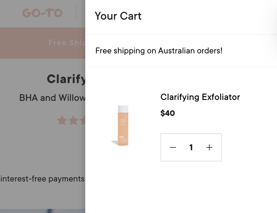
Having a visible side cart or cart icon in the top menu ensures customers can easily access and proceed to checkout or cart when ready. This feature makes it clear to customers when they have added items and what to do next. And how to quickly move to payment.
Don’t have one included in your theme? Try this app.
8. Streamline the Checkout Process
Offering multiple payment options can cater to different customer preferences and streamline the checkout process. This can significantly improve the user experience and increase conversions.
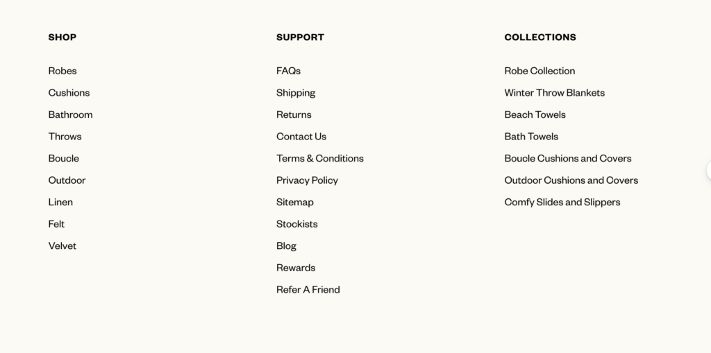
9. Utilize the Footer
The footer of the website should be used to provide important information and categorize it neatly for easy access. This can include non-selling items that don’t need to be in the top menu. Things like all your policies, your blog or journal and even a repeat of your collections again. Don’t forget to have some shopping options available though for those who are still keen to buy! Make sure you add in your location too. To add to your trust factors.
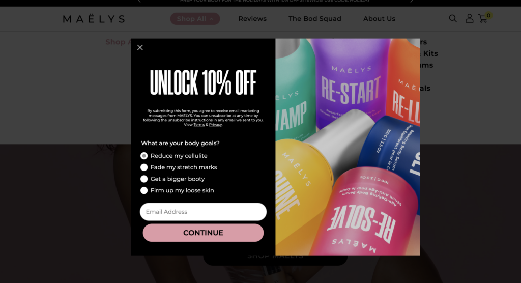
10. Additional Elements
Finally, there are additional elements such as rewards programs and pop-ups that can further enhance the user experience and boost conversions.
Get started today by implementing these ten essential elements. I believe you can create a high-converting website that drives more sales and increases profitability. So, start optimizing your website today and watch your conversions soar!
Want more juicy deets? Grab my 50 page checklist for boosting web conversions here.
If you want help with HOW to make all this happen on your website join my 5 part series BOOST your WEBSITE SALES mini series .
Find out more here. It is an easy and practical way to increase those website sales for your e-commerce store.

Comments +