What do want? More sales? How do we get it? More traffic (NO!!!)
I am sharing with you today ways to make more sales for every customer that comes to your website.
We are starting with the: Essential elements to your website home page.
Are you a Retail store or Product-based business?
If you sell online then you are going to want to check this out.
Your homepage is the most important real estate in your store, so you have to make sure you use it wisely and optimise it.
Essential elements every home page must have!!! (and yes these will get you more sales…)
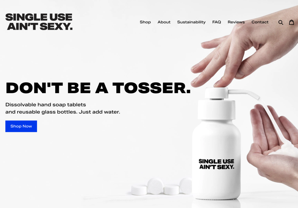
- A clear and defined statement about what you sell or what is unique about you. This should be shown ‘above the fold’ essentailly without having to scroll at all. For some stores that may be easy and your banner image you have would inlcude a Heading and subheading outlining what you sell and what is special about you. Take this image for example. The Single Use Ain’t Sexy are dissovable hand soap tablets that replace the need to buy new plastic bottles regualarly. In their subheading they explain just that.
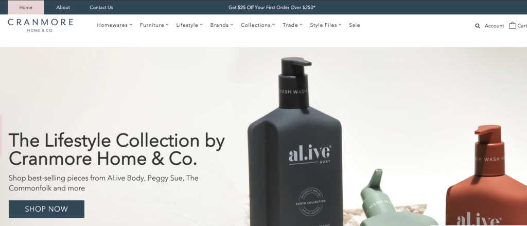
If you are a lifestyle store with lots of different brands and types of products then your image should showcase this with a brand image that showcases the style of your store well. Example if you are bright and colourful then having a Kip and Co image on the front will showcase that. If you more of a boho natural store then having an image with that colour palette is imporatant. i.e you may use a Karina Jambrak or a A.live body image that has the the tones that represent you. Or it may be shown in your logo or within your menu *(showing what you sell).
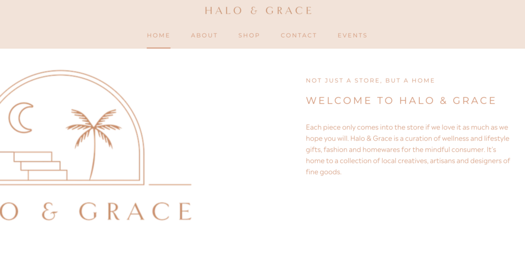
You may use the next section of your website to give a brief desciption of what you sell or your unique point of difference. LIke Halo and Grace here.
2. Always always always have a clear and high contrast CTA (call to action) button also. It can say SHOP NOW, or BUY NOW, or VIEW PRODUCTS, VIEW MORE, whatever you like but make it obvious and make it high contrast like the Single Use Aint Sexy above. Even if it is not in your ‘brand colours’ you need a high contrast so it is the main thing that customers notice and they know exactly how to get to the next stage on your website.
3. Next up is having an amazing MENU to navigate and find things with!! DO not just have the word SHOP and that is all. Give me more. Tell me what you sell. This is especially important if you sell many categories. List these across your top menu and then have drop down options so I can naviagte further. SHown here are tow that explain perfectly what is available.


If you do only sell the one thing then I can maybe forgive you for having the word SHOP only!!
Ideally when it comes to clear navigation, it’s very simple: put only money-making links in your main navigation—meaning only provide links to locations where people can buy something. All your other things can be in your footer. Like contact, wholesale, about etc…..
4. Next up is to Include a search bar!!!! And make it really really obvious. DO not just have a magnifying glass icon . That is not clear enough.
Always check back with your google analytics too. There is a report in googel analytics also for serch terms so you can see what customers are seaching for that maybe you do not even have. This could showcase opportunies here. Or allow you to make edits to help guide customers to the items they are after.
If you have a look at al the worlds top ecommerce sites they have huge search bars across the top. This is for a REASON!! They work and they help increase sales. End of story.
See examples here from Amazon, JB Hifi (one of Australia’s best performing ecommerce stores) Asos, Country Road.
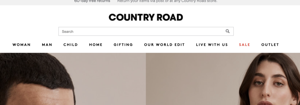


Depending upon your theme it may already be available or at the very least you shoud dd the weord search next to the icon so it is really obvioucs.
Different themes show different options. Get in touch with whoever created your theme (ie either Shopify if free theme or the theme developer) or google “your theme and how to add search option”.
5. Last one for today on the essentials list is good IMAGERY. You cannot sell products without good imagery.
It seems pretty self explanatory right but you would be amazed at how many online store owners know this but stil do not invest in getting good magery of their product. Or insisting the the brands they sell give it to them!! I had a brand back in 2005 and even then our stockists started asking for product photography (I was aghast we had to pay for it but still times have changed!).
Invest in your photos for both the product shots as well as lifestyle styled shots. They will sell the product for you. It is a no brainer. They are woth the investment in your brand. ANd if you are a mixed Retailer (have lots of different brands in store) then invest in some of your own photography also so that you can have different images to everyone else occassionally (even if it means in your store but it is styled or the image taken by a professional once in a while).
Kip and Co and Sage and Clare do an amazing job with their imagery.
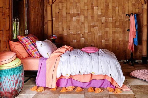
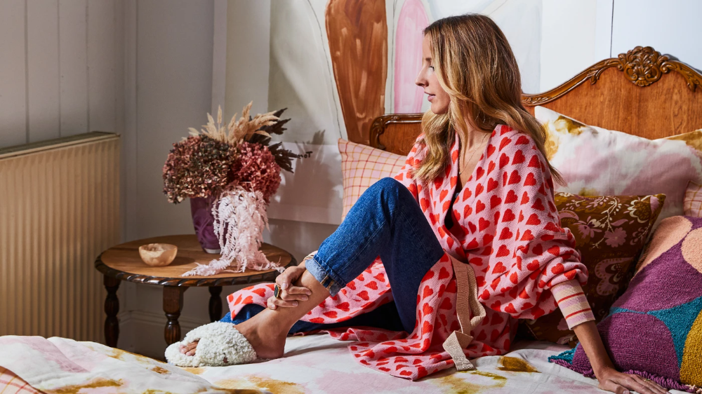
This is just scratching the surface of website tips. But I hope this helps you make a few edits that in turn will increase your conversion rate and make more sales!!! I will continue to add tips for each page of your website to help you make more sales with the traffic you have.
To dive deeper into all these tips and tricks I have the Get your Business Online Ready short program. A super quick 3 part series to really make sure you are putting your best foot forward with your online website, social media and marketing also. Or if you want it in short and sharp bursts head to my 5-day series to increase your website numbers
Or if you like a personal approach I offer 1 on 1 Private Coaching for Product-based businesses run by kick ass woman!!
Talk soon,
Melissa. xx

Comments +